Category: Lecture notes

Week 7 – User Interface Visual Design Patterns

Reflection

The user interface works closely with user experience to join together to create a more well-rounded and sophisticated website and user experience. The term is used to explain how the user and a computer system interact.

There are 4 main navigation patterns and they are 

Tabs: Navigation and module tabs. Tabs help separate information into sections and is accessible in a navigation system.

Menus: Horizontal dropdown, vertical dropdown, vertical dropdown. Used to help user navigate through sections. Useful when there is limited space on the page, creates less clutter.

Content: Carousel, Event Calendar, Article list. These are used to save space on a page and to lessen clutter.

Jumping in hierarchy: Shortcut dropdown, Fat footer, Home link and Breadcrumbs

Week 6 – User Scenarios

Notes

  • User scenarios are the stories your personas act out.
  • Can predict how certain users (shown by your persona) will interact with your design.
  • Allow you to test site structure before it fully made and allows you to spot mistakes.
  • Highlights the motivation of the user.

Reflection

During this lecture, I learnt how important user scenarios are in building a product that is suitable for a target audience. I have a deeper understanding of how personas and user scenarios interact with each other to create a more well-rounded and successful design. The user scenarios include information about the user’s motivations, goals, expectations, and their actions and reactions. This information helps to reflect on the way a system is used in the context of a person’s individual life. Combining scenarios and personals we are able to gain context of our product and can create a more solid foundation of our design before we go forward and develop the specific design.

Week 5 – Personas

Notes

  • User personas used since the mid 1990’s
  • Used to inform and validate our design and user experience
  • Usually synthesised from data gained from interviewing users, with added fictional details to make a complete person
  • One primary persona should be made to encompass all users
User personas include:
  • Age
  • Sex
  • Occupation
  • Hobbies
  • Likes/dislikes
  • Other details relating to the product: behaviour patterns, goals, skills, attitudes, environment, context
  • The persona helps design with an idea for your user base in mind and what they would want and need.
  • Depending on the process more or less personas can be used 
  • Small user bases can lead to more specific personas
  • Mental models illustrate how the user will approach a particular problem, you’re creating a bad experience if you don’t use these models
Product personality questions
  • If the interface were a person, what would she or he be like?
  • How would you expect users to react when they first view the product?
  • How would you describe this product to a friend?
  • How is the product different from competitive products?
  • Which celebrity (or car, movie, etc.) Is the product most like?

Least like?

Why?

Reflection

This lecture went over the importance of personas and emphasised that they are one of the foundation steps in the design process and is needed to continue driving the process forwards. Personas give the designer the ability to picture how the consumer would use their product, thus making it easier to plan out an interface that will suit the needs and lives of the target audience.

I did not know what mental models were before watching this lecture and I learnt how they impact the design process as they are the thoughts people have in regards to an idea or activity. Combining the use of personals and mental modes a designer will be able to make a better more suitable product for their target audience.

Week 4 – Instructional Design

Notes

  • How to “do something”, or to explain how something works.
  • Instructions are interacted with daily, etc ticket machines, parking machines or using dishwashers.
  • Poorly designed instructions make the experience infuriating for the user
  • Image design instructions are simple but not as helpful but gets rid of the language barrier.
  • Working memory refers to how we manipulate information stored in our short term memory, is a key executive function. It is limited.
  • Splitting information up will overload the memory and make reading the instructions overwhelming
  • Photography can often have too much detail and information to work well in instructions, it is hard to distinguish what is most important.
  • Simple graphics can highlight the most important details, colour often also helps with this.
Kinds of interaction (screen based experiences)

– instruction – by clicking buttons

– conversation – back and forth dialog

– manipulation – drag and drop elements

– exploration – open, playful, game like

Reflection

I learnt during this lecture that instructions are ingrained more in our life than I had previously thought and how the layout and style of illustration is able to completely change how our brain is able to process and retain the information, this also taught me how working memory works and that the process for designing instructions is much more in-depth and more important than it seems.

Week 3 – Design Patterns

During this lecture I learned that more and more, designers are being encouraged to begin their web designs with mobile first because it becomes difficult to make a large design for web and then scale it down so it is able to fit the mobile size. Another point I found interesting is how many websites nowadays are beginning to look similar to each other because of how web has evolved and how the viewer now uses the web, these changes end up causing designers to use a common interface pattern to suit the times.

The many type of design patterns include:

  • The hamburger menu: a button made up of three horizontal lines, usually placed at the top of the page.
  • Long/endless scroll: useful for not breaking up information and is better for storytelling.
  • Card layout: condensed webpage with cards showing content to the user that can be clicked on to receive more information. This is a popular design most notably showcased in places such as Instagram and Pinterest.
  • Responsive design: a design that moves with the size of the webpage.

Week 2 – Process + Context

Process

For process the lecture goes to show an 8 part process as depicted in the diagram provided

This process is used for the designer to go through the stages of inventing, designing and engineering their product.

During the design process low tech designed and ideas are extremely important; these are sketches and drawings that can be on anything from paper to sticky notes and they are used to begin fleshing out your ideas before anything goes onto a computer. Making clear digital prototypes will always be an extremely important step of an interactive design project but traditional sketching will always have its place in the process and combining the two leads to a better overall finished prototype.

Context

Context includes the context for use and the context of use when creating an interactive project.

As designers we need to be able to understand what people are trying to do, how they may try to do it, what gets in the way or helps and where they might be doing it. This pod gives examples for these processes and the different contexts for and of use and is then further explained how different design solutions could be used for the context scenario. This allows for interaction design solutions to facilitate their behaviour.

Week 1 – Introduction to Interactive Design

Lecture 1 – introduction to interactive design

– Interaction and interactive design from a broad perspective

– Button, links, form fields etc are a part of interaction design

– Graphic designers should be able to perform basic interaction design for clients

– Key questions of designing interaction for users: how to you do, feel and know

– Perception on screen and not are vastly different from each other.

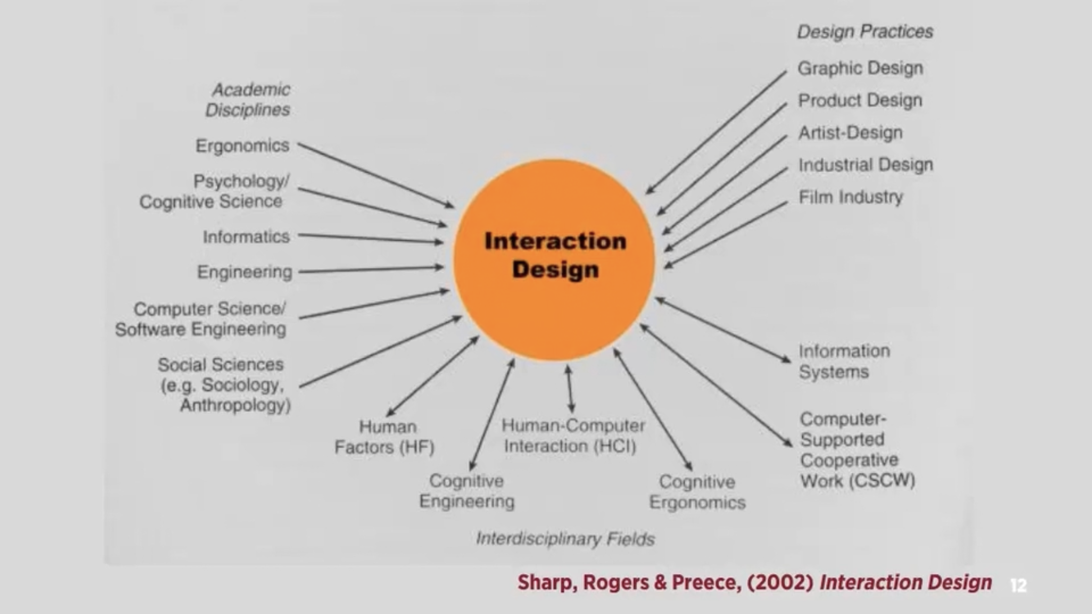
– Interaction design: “designing interactive products to support people in their everyday and working lives” – sharp, Rogers and Preece

”the design of spaces for human communication and interaction” – winograd

Interactivity

How we think of the word

– Of or relating to a program that respond to user activity (computer science)

– Working together so the total effect is greater than the sum (2 or more)

– Capable of acting on or influencing each other

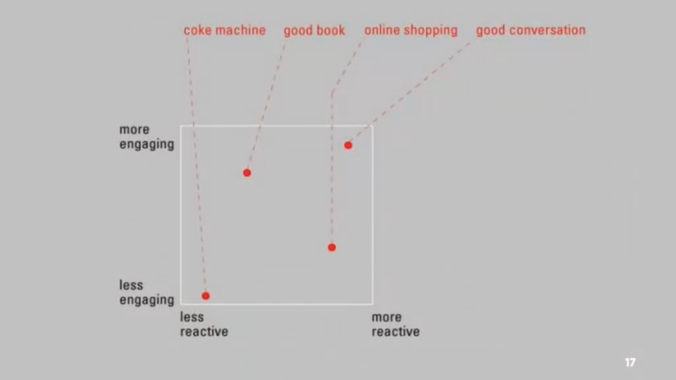
– Interactions can be vastly different from reading books, using vending machines and having conversations

– Diagram 3 – maps 4 different interactions with their ability to interact to us

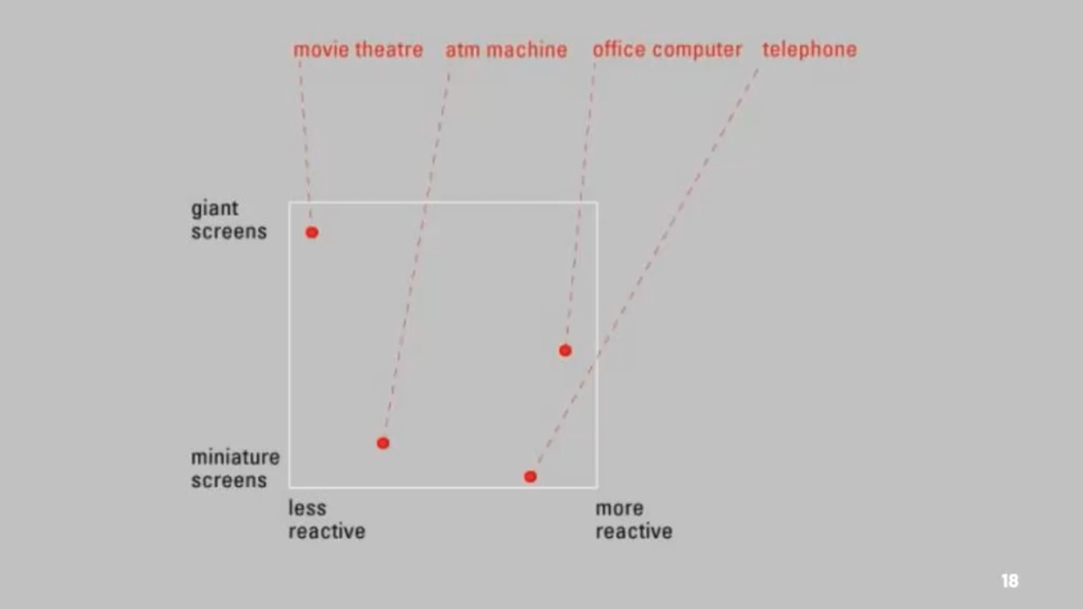
– Diagram 4 – different interactions and how screen size effects their ability to interact with us

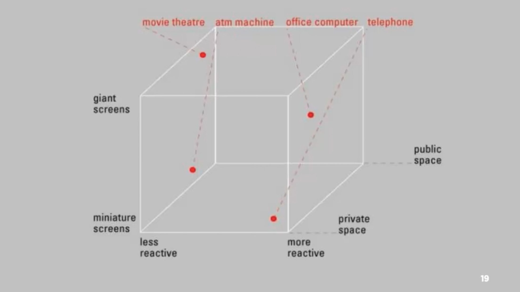
– Diagram 5 – adding public and private space to the previous diagram

– Many movies create amazing passive experiences but have little to no interactivity, whereas things such as stories or games allows for interactivity when the player progresses

– Diagram 6 – experience design

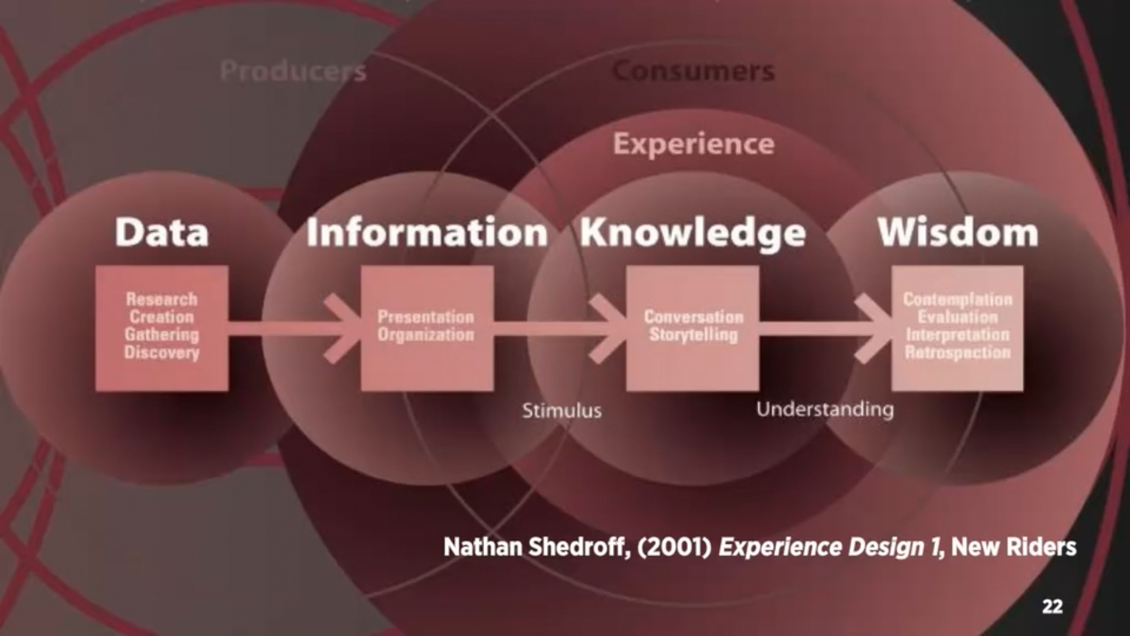
– Data becomes meaningful information when it is organised and presented

– Must first understand your audience, what their needs and expectations are before you are able to create meaningful experiences

– Interactive media is not about information, it’s about experience. But to create these experiences we need to understand the information and structure.

– Five key design areas of interaction design: interactivity, information architecture, time and motion, narrative, interface