First Screen Design
Screen Design Feedback

Screen Redesign




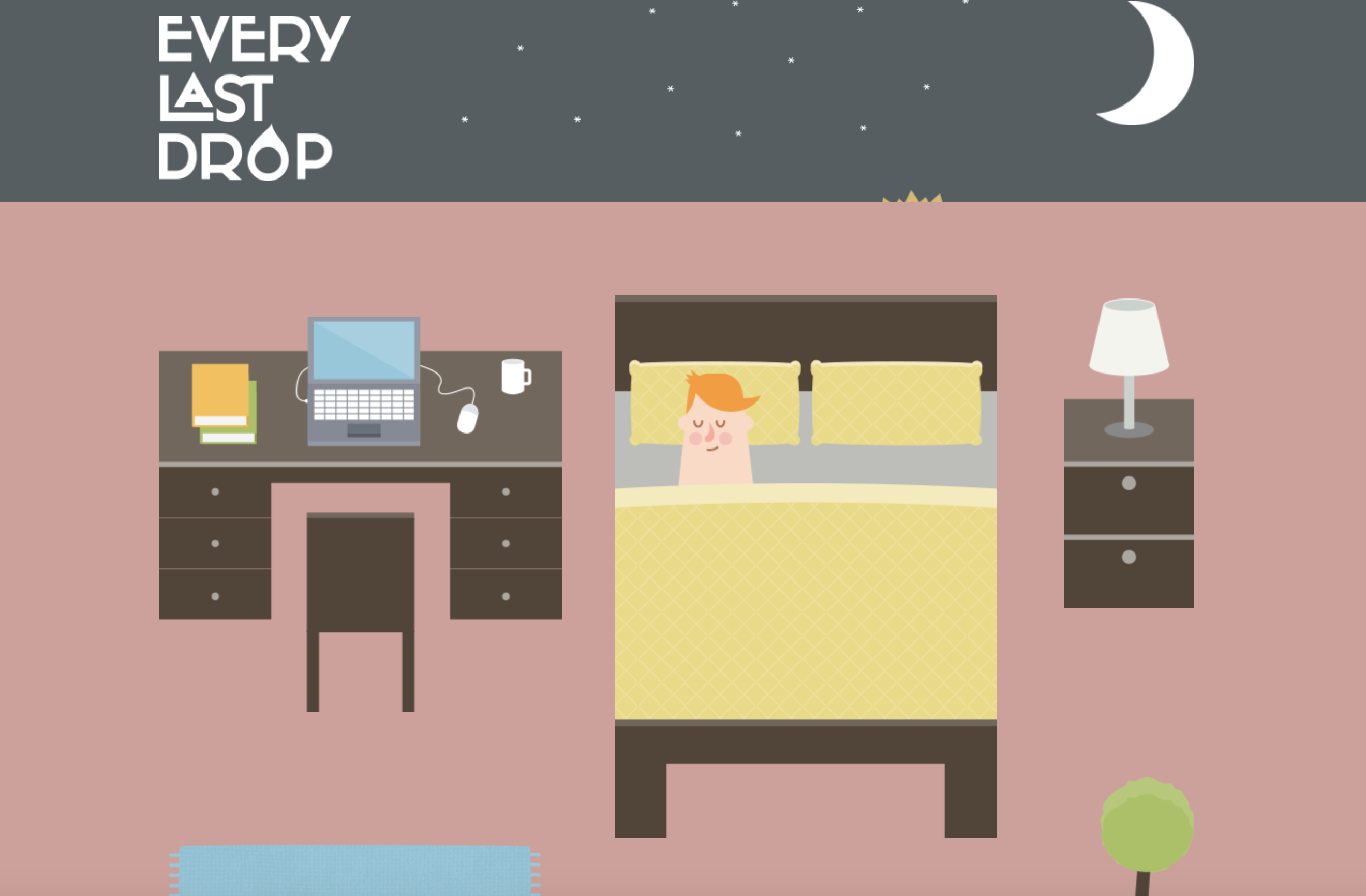
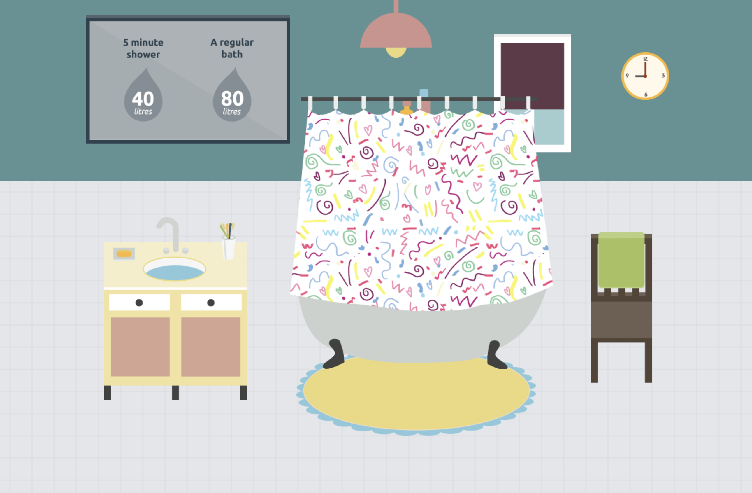
What is the interactive about?
– This interactive website informs people about how much water is wasted daily
– Includes ways to reduce the amount of waste being made
– Provides short yet informative points (gets straight to the point)
– Places emphasis on why “every last drop” counts
– Informs that water isn’t just wasted on showers or washing the dishes, but is also wasted in other areas in our lifestyle – water is wasted depending what brand of clothes you buy or even the type of food you eat.
Who is it designed for? (Target Audience)
– The website is designed for any age as the text is only of a few words and the interactive animation visually helps the audience to understand the fundamental points of water waste.
– particularly useful for a younger audience as the colours and simple illustrations help convey the meaning in a clear and interesting way. Though it’s combination of illustration and factual text makes it a useful website for all
What knowledge does it assume of the target audience i.e. digital literacy?
Describe the type of user interactions, and the user interface.
– User must scroll down the page to see the sequence of information being portrayed
– Each time the user scrolls down the page animations from a scene disperse and then form together to create the next scene
What can you say about the visual design – layout, colour, and typography? How would you describe the style?
– The style of this website is heavily made in an illustrative style, or cartoon like animation as the objects created are very simple
– The layout is user friendly on all devices. The layout is also very simple as the user only interacts with the website by scrolling
– The colours are vibrant and fun, making it interesting to look at and appealing to the eye.
– The typography is simple and easy to read. The typography changes with each scene to suit the environment
What improvements would you suggest?
– A clearer understanding of how to navigate through this website, i.e. a more striking and noticeable arrow or sign directing the user to scroll down.
– Improvement would be having an introduction or brief story into what the user is about to be reading
– The facts could be expanded and more information about how and why so much water is lost
– Provide the user with a deeper understanding as to why it is so beneficial. I.e what are the long term impacts of wasting so much water?
– more specific information could be added to teach the audience how to lower their water usage
The user interface works closely with user experience to join together to create a more well-rounded and sophisticated website and user experience. The term is used to explain how the user and a computer system interact.
There are 4 main navigation patterns and they are
Tabs: Navigation and module tabs. Tabs help separate information into sections and is accessible in a navigation system.
Menus: Horizontal dropdown, vertical dropdown, vertical dropdown. Used to help user navigate through sections. Useful when there is limited space on the page, creates less clutter.
Content: Carousel, Event Calendar, Article list. These are used to save space on a page and to lessen clutter.
Jumping in hierarchy: Shortcut dropdown, Fat footer, Home link and Breadcrumbs

Project Title
Q&Ocean
Overview
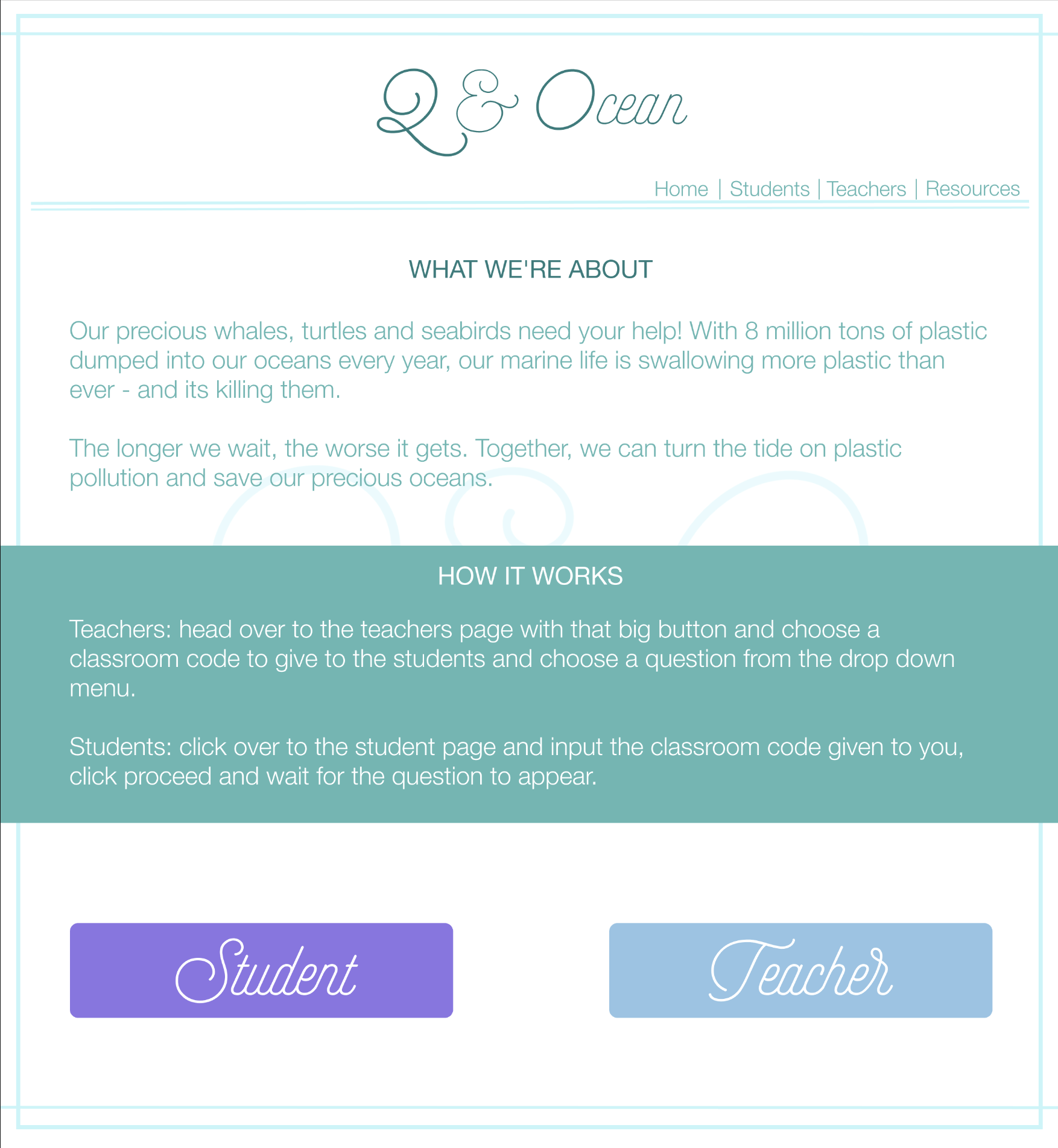
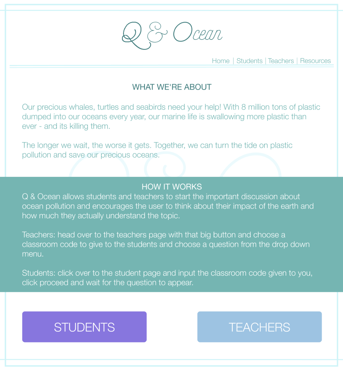
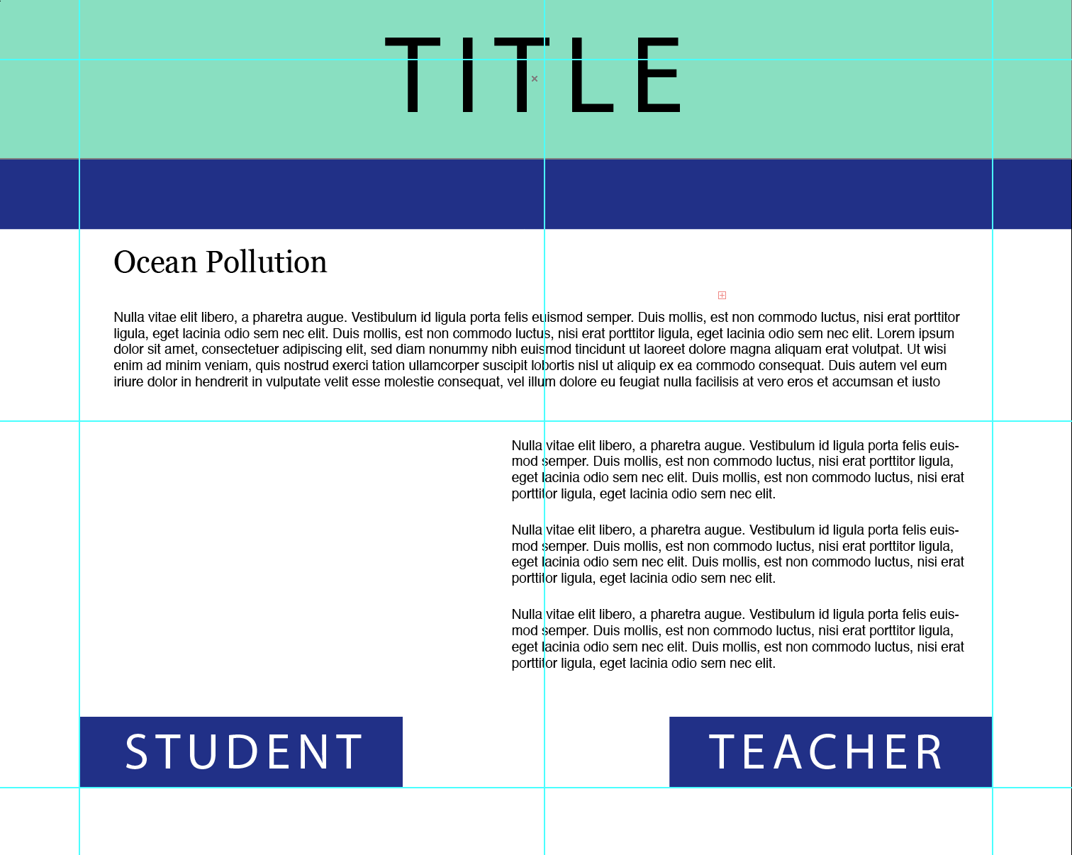
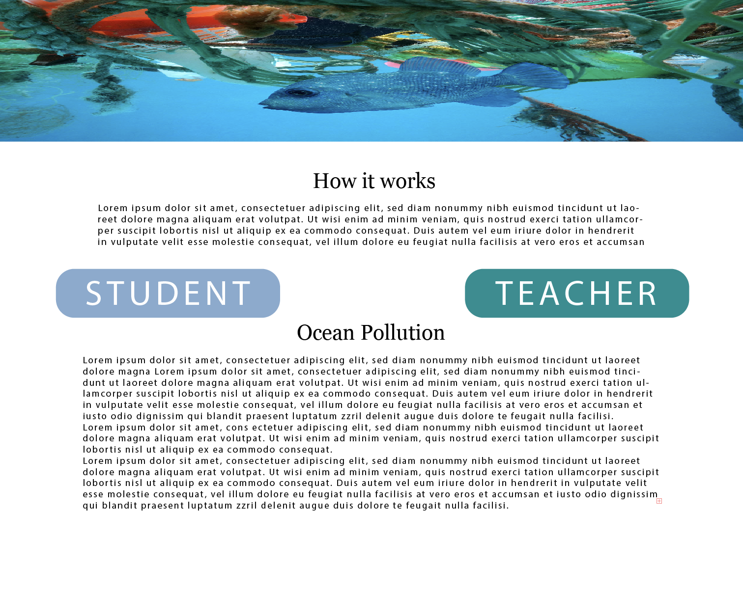
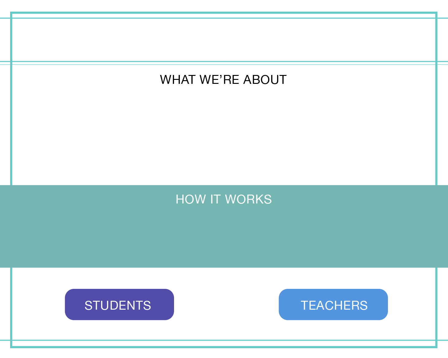
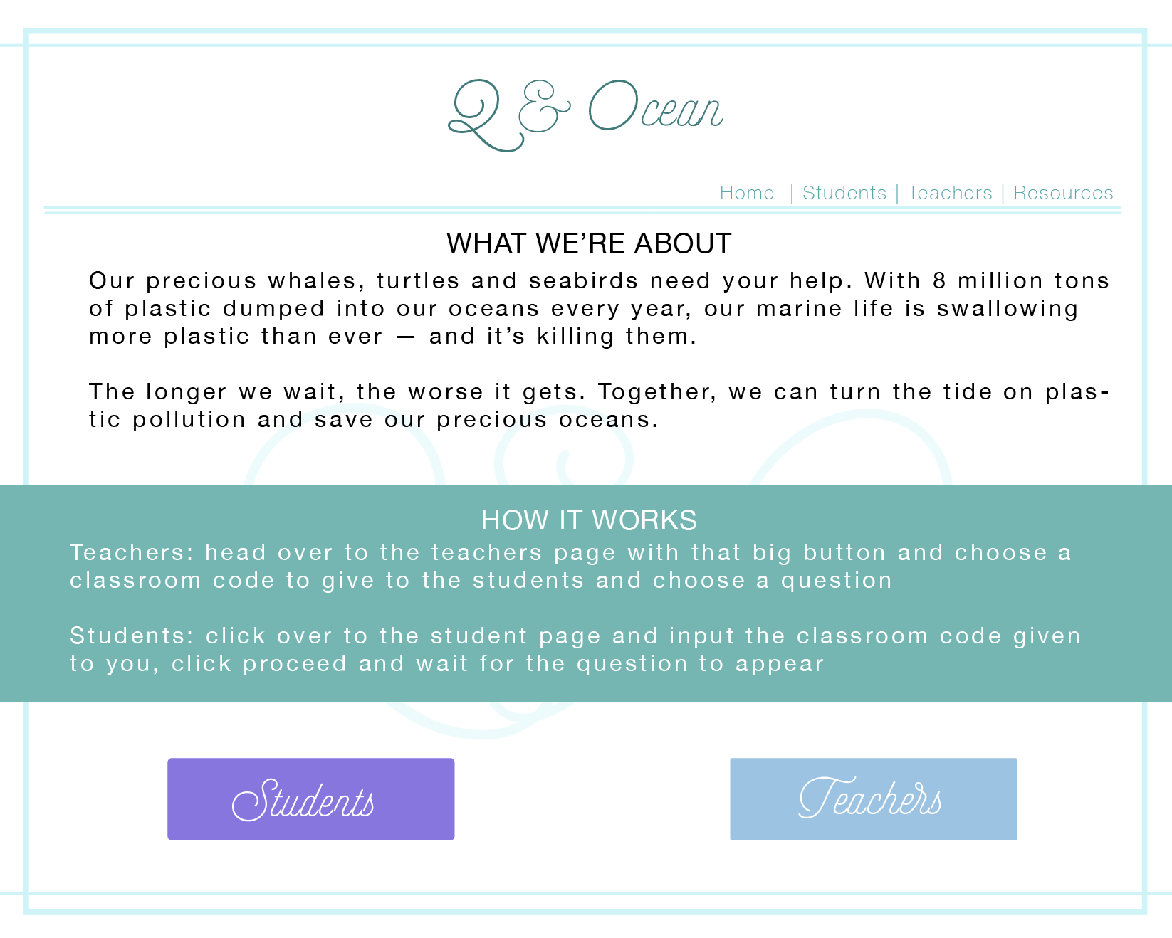
The concept of my project started out with the idea of providing resources for schools that were both engaging for students and informative. With this goal in mind I decided to create a free accessible website for both students and teachers, that will allow teachers to create online classrooms that the students are able to join, where the class is able to all individually answer questions chosen by the teacher and then look at the results together through the teacher’s screen. Showing the results in a poll allows for classroom discussion on why the students believe the highest answer may have been chosen, leading on from this the teacher is then able to click through to show an in-depth explanation of the correct answer.
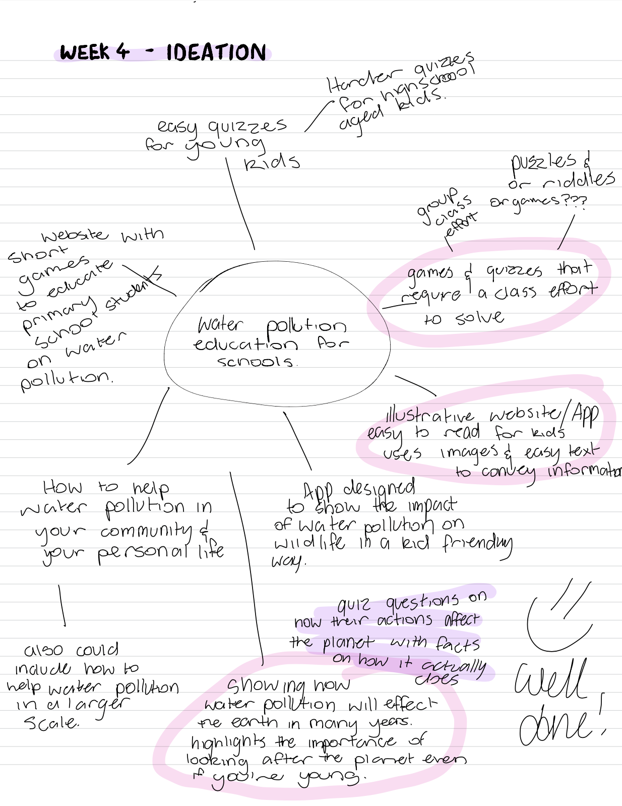
My approach to this project was to focus on creating an interesting way to allow for students to learn about ocean pollution and learn how they can within their personal lives, reduce their impact.
Intended/Target Audience
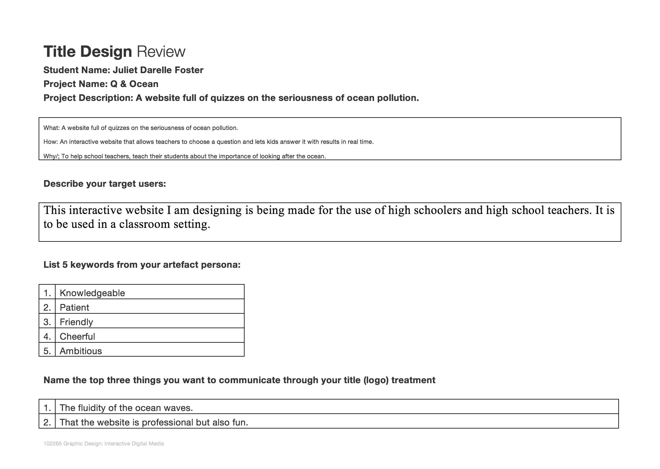
This interactive website I am designing is being made for the use of high schoolers and high school teachers. It is to be used in a classroom setting.
Aims
During this lecture, I learnt how important user scenarios are in building a product that is suitable for a target audience. I have a deeper understanding of how personas and user scenarios interact with each other to create a more well-rounded and successful design. The user scenarios include information about the user’s motivations, goals, expectations, and their actions and reactions. This information helps to reflect on the way a system is used in the context of a person’s individual life. Combining scenarios and personals we are able to gain context of our product and can create a more solid foundation of our design before we go forward and develop the specific design.
Least like?
Why?
This lecture went over the importance of personas and emphasised that they are one of the foundation steps in the design process and is needed to continue driving the process forwards. Personas give the designer the ability to picture how the consumer would use their product, thus making it easier to plan out an interface that will suit the needs and lives of the target audience.
I did not know what mental models were before watching this lecture and I learnt how they impact the design process as they are the thoughts people have in regards to an idea or activity. Combining the use of personals and mental modes a designer will be able to make a better more suitable product for their target audience.
